...
.ent-full-hero, .ent-full-hero *{ box-sizing:border-box; } .ent-full-hero{ width:100vw !important; max-width:100vw !important; margin-left:calc(50% – 50vw) !important; margin-right:calc(50% – 50vw) !important; margin-top:0 !important; margin-bottom:22px !important; padding:0 12px !important; } .ent-full-hero__frame{ position:relative !important; width:100% !important; height:280px !important; overflow:hidden !important; border-radius:24px !important; border:1px solid rgba(226,232,240,.95) !important; box-shadow: 0 18px 42px rgba(15,23,42,.10), 0 8px 20px rgba(15,23,42,.06) !important; background:#fff !important; } .ent-full-hero__img{ position:absolute !important; inset:0 !important; width:100% !important; height:100% !important; max-width:none !important; object-fit:cover !important; object-position:center center !important; display:block !important; border:0 !important; border-radius:0 !important; box-shadow:none !important; } @media (max-width:900px){ .ent-full-hero__frame{ height:240px !important; border-radius:20px !important; } } @media (max-width:640px){ .ent-full-hero{ padding:0 10px !important; margin-bottom:18px !important; } .ent-full-hero__frame{ height:200px !important; border-radius:18px !important; } }
Sustainable travel for digital nomads on a tropical island with white sand, turquoise water, and a peaceful eco-friendly setting
/* ========================= ONE WIDTH SYSTEM (LOCAL)========================= */#eco-home-top{ –eco-wrap: 1200px; –eco-pad: 16px; –eco-pad-sm: 14px; –eco-ink: #0f172a; –eco-text:#1e293b; –eco-muted:#64748b; –eco-line:#e2e8f0; –eco-soft:#f8fafc; –eco-blue:#2563eb; –eco-blue2:#1d4ed8; –eco-radius:18px; –eco-shadow:0 12px 28px rgba(15,23,42,.10); –eco-shadow2:0 10px 22px rgba(15,23,42,.08); font-family:system-ui,-apple-system,Segoe UI,Roboto,Inter,Arial,sans-serif; color:var(–eco-text);}#eco-home-top, #eco-home-top *{ box-sizing:border-box; }#eco-home-top .eco-container{ max-width:var(–eco-wrap); margin:0 auto; padding:0 var(–eco-pad);}@media (max-width:640px){ #eco-home-top .eco-container{ padding:0 var(–eco-pad-sm); }}/* ========================= ACCESSIBLE “VISUALLY HIDDEN” (SEO-safe)========================= */#eco-home-top .sr-only{ position:absolute !important; width:1px;height:1px; padding:0;margin:-1px; overflow:hidden; clip:rect(0,0,0,0); white-space:nowrap;border:0;}/* ========================= UPDATED META========================= */#eco-home-top .home-updated-meta{ text-align:center; font-size:.9rem; color:var(–eco-muted); margin:8px 0 18px;}/* ========================= HERO (robust height, no grey, fills always)========================= */#eco-home-top .eco-hero{ position:relative; width:100%; margin:0; overflow:hidden; background:#0a1a12;}#eco-home-top .eco-hero::before{ content:””; display:block; padding-top:36%; /* desktop height */}@media (max-width:640px){ #eco-home-top .eco-hero::before{ padding-top:75%; } /* 4:3 mobile */}#eco-home-top .eco-hero__img{ position:absolute; inset:0; width:100%; height:100%; object-fit:cover; object-position:50% 10%; display:block;}#eco-home-top .eco-hero__inner{ position:absolute; inset:0; display:flex; align-items:flex-end; justify-content:center; padding:0 16px clamp(18px,6vw,56px);}#eco-home-top .eco-hero__overlay{ width:min(82vw,580px); border-radius:16px; padding:clamp(14px,3.6vw,24px); background:linear-gradient(to bottom, rgba(0,0,0,.30), rgba(0,0,0,.55)); color:#fff; text-align:center;}#eco-home-top .eco-hero__overlay h1{ margin:0 0 8px; font-size:clamp(1.6rem,4vw,2.6rem); line-height:1.2; font-weight:950;}#eco-home-top .eco-hero__overlay p{ margin:0; font-size:clamp(.95rem,2.3vw,1.15rem); opacity:.95; line-height:1.5;}/* ========================= INTRO (Desktop full / Mobile short) Best practice: keep full text in DOM for SEO, show a concise version on mobile.========================= */#eco-home-top .eco-intro{ margin:12px 0 12px; font-size:1.02rem; line-height:1.55; color:var(–eco-ink);}#eco-home-top .eco-intro a{ color:#0ea5e9; text-decoration:none; font-weight:800;}#eco-home-top .eco-intro a:hover{ text-decoration:underline; }/* Mobile: show concise summary, hide long paragraph visually */#eco-home-top .eco-intro–mobile{ display:none; }@media (max-width:640px){ #eco-home-top .eco-intro–desktop{ display:none; } #eco-home-top .eco-intro–mobile{ display:block; font-size:1rem; line-height:1.42; margin:10px 0 10px; }}/* ========================= TOOLS STRIP (same exact width)========================= */#eco-home-top .eco-tools-strip{ margin:16px 0 14px; padding:12px 0 14px; background:radial-gradient(circle at top left,#e0f2fe 0,#eff6ff 45%,#ffffff 100%); border:1px solid rgba(148,163,184,.35); border-radius:var(–eco-radius); box-shadow:var(–eco-shadow2);}#eco-home-top .eco-tools-label{ margin:0 0 10px; font-size:.85rem; text-transform:uppercase; letter-spacing:.08em; color:var(–eco-muted); font-weight:900;}#eco-home-top .eco-tools-row{ display:flex; flex-wrap:wrap; gap:8px; justify-content:center;}#eco-home-top .eco-tool-card{ flex:0 1 calc(33.333% – 8px); min-width:210px; max-width:260px; display:flex; align-items:center; gap:8px; padding:8px 12px; background:#fff; border-radius:999px; border:1px solid rgba(148,163,184,.55); box-shadow:0 4px 12px rgba(15,23,42,.08); text-decoration:none; color:#0f172a; font-size:.86rem; transition:transform .12s ease, box-shadow .12s ease, border-color .12s ease;}#eco-home-top .eco-tool-card strong{ display:block; font-size:.9rem; font-weight:950; }#eco-home-top .eco-tool-card small{ display:block; font-size:.75rem; color:var(–eco-muted); font-weight:700; }#eco-home-top .eco-tool-icon{ width:26px;height:26px; border-radius:999px; display:inline-flex; align-items:center; justify-content:center; background:linear-gradient(135deg,#0ea5e9,var(–eco-blue)); color:#fff; font-size:.95rem; flex:0 0 auto;}#eco-home-top .eco-tool-primary{ border-color:rgba(37,99,235,.55); background:linear-gradient(135deg,#dbeafe,#eff6ff);}#eco-home-top .eco-tool-card:hover{ transform:translateY(-1px); box-shadow:0 8px 18px rgba(15,23,42,.14); border-color:rgba(37,99,235,.85);}@media (max-width:768px){ #eco-home-top .eco-tool-card{ flex:1 1 100%; max-width:none; }}/* ========================= CTA + TRUST (same width, different visual than tools) Fix: buttons not “too long” → fit-content + clamp========================= */#eco-home-top .cta-trust{ margin:18px 0 18px;}#eco-home-top .cta-trust__panel{ border:1px solid var(–eco-line); border-radius:var(–eco-radius); background:linear-gradient(180deg,#fff 0%, #f6fbff 100%); box-shadow:var(–eco-shadow2); overflow:hidden;}#eco-home-top .cta-trust__top{ display:grid; grid-template-columns: 1.15fr .85fr; gap:14px; padding:18px; align-items:start;}#eco-home-top .cta-trust h2{ margin:0 0 8px; color:var(–eco-ink); font-weight:950; line-height:1.15; font-size:clamp(1.25rem,1.05rem + .8vw,1.7rem);}#eco-home-top .cta-trust p{ margin:0; color:var(–eco-muted); line-height:1.7; }#eco-home-top .btn-blue{ display:inline-flex; align-items:center; justify-content:center; margin-top:12px; padding:10px 16px; border-radius:999px; background:linear-gradient(180deg,var(–eco-blue),var(–eco-blue2)); color:#fff; font-weight:950; text-decoration:none; box-shadow:0 10px 20px rgba(37,99,235,.28); white-space:nowrap; /* prevents “way too long” */ width:fit-content; max-width:100%;}#eco-home-top .btn-blue:hover{ filter:brightness(1.03); transform:translateY(-1px); }#eco-home-top .btn-blue:focus-visible{ outline:2px solid rgba(37,99,235,.6); outline-offset:2px; }#eco-home-top .cta-trust__meta{ background:rgba(255,255,255,.78); border:1px solid var(–eco-line); border-radius:16px; padding:12px;}#eco-home-top .author-row{ display:flex; gap:10px; align-items:flex-start; padding-bottom:10px; border-bottom:1px solid var(–eco-line); margin-bottom:10px;}#eco-home-top .author-photo{ width:44px;height:44px; border-radius:999px; overflow:hidden; border:2px solid #bfdbfe; flex:0 0 auto;}#eco-home-top .author-photo img{ width:100%;height:100%; object-fit:cover; object-position:50% 10%; display:block;}#eco-home-top .author-text .name{ display:block; font-weight:950; color:var(–eco-ink); line-height:1.2; margin-bottom:2px;}#eco-home-top .author-text span{ display:block; color:var(–eco-muted); font-size:.92rem; line-height:1.45;}#eco-home-top .socials{ display:flex; flex-wrap:wrap; gap:8px;}#eco-home-top .socials a{ display:inline-flex; align-items:center; padding:7px 10px; border-radius:999px; border:1px solid var(–eco-line); background:#fff; text-decoration:none; font-weight:900; color:#111827; font-size:.88rem; white-space:nowrap;}#eco-home-top .socials a:hover{ background:#eef5ff; }#eco-home-top .cta-trust__bottom{ border-top:1px solid var(–eco-line); padding:14px 18px 16px; background:#fff;}#eco-home-top .cta-trust__bottom h3{ margin:0 0 6px; font-size:1.05rem; font-weight:950; color:var(–eco-ink); line-height:1.2;}#eco-home-top .cta-trust__links{ margin-top:8px; font-weight:900;}#eco-home-top .cta-trust__links a{ color:var(–eco-blue); text-decoration:none;}#eco-home-top .cta-trust__links a:hover{ text-decoration:underline; }#eco-home-top .quicklinks{ margin-top:10px; padding-top:10px; border-top:1px dashed var(–eco-line); color:var(–eco-muted); font-size:.95rem; line-height:1.55;}#eco-home-top .quicklinks a{ color:var(–eco-blue); font-weight:900; text-decoration:none;}#eco-home-top .quicklinks a:hover{ text-decoration:underline; }@media (max-width:860px){ #eco-home-top .cta-trust__top{ grid-template-columns:1fr; } #eco-home-top .btn-blue{ width:100%; white-space:normal; }}/* ========================= “HOW TO PLAN…” INTRO BLOCK (FIX IMAGE FILL)========================= */#eco-home-top .ent-intro{ margin:18px 0 12px;}#eco-home-top .ent-intro__inner{ display:grid; gap:22px; grid-template-columns: 1.05fr 1.25fr; align-items:center; padding:18px 0;}#eco-home-top .ent-intro h2{ margin:0 0 10px; color:var(–eco-ink); font-size:clamp(1.45rem, 1.25rem + 1.05vw, 2.05rem); line-height:1.15; font-weight:950;}#eco-home-top .ent-lede{ margin:0 0 12px; color:var(–eco-muted); font-size:clamp(1rem, .95rem + .2vw, 1.1rem); line-height:1.6;}#eco-home-top .ent-bullets{ margin:0 0 14px; padding:0; list-style:none;}#eco-home-top .ent-bullets li{ display:flex; gap:10px; align-items:flex-start; margin:8px 0; line-height:1.45; color:var(–eco-ink);}#eco-home-top .ent-bullets li::before{ content:”✓”; color:var(–eco-blue); font-weight:950; margin-top:2px;}#eco-home-top .ent-cta{ display:flex; flex-wrap:wrap; gap:10px;}#eco-home-top .ent-btn{ display:inline-flex; align-items:center; justify-content:center; padding:10px 16px; border-radius:999px; text-decoration:none; font-weight:950; white-space:nowrap;}#eco-home-top .ent-btn.primary{ background:linear-gradient(180deg,var(–eco-blue),var(–eco-blue2)); color:#fff; box-shadow:0 10px 20px rgba(37,99,235,.28);}#eco-home-top .ent-btn.ghost{ background:#e8f1ff; color:var(–eco-ink); border:1px solid rgba(37,99,235,.18);}/* Media layout */#eco-home-top .ent-media{ display:grid; grid-template-columns: 2fr 1fr; gap:14px; align-items:stretch; min-width:0;}#eco-home-top .media-card{ border-radius:var(–eco-radius); overflow:hidden; box-shadow:var(–eco-shadow2); background:#fff; /* prevents white edges showing through */ position:relative;}#eco-home-top .media-card::before{ content:””; display:block; padding-top:62.5%; /* 16:10 */}#eco-home-top .media-card img{ position:absolute; inset:0; width:100%; height:100%; object-fit:cover; object-position:center; display:block;}#eco-home-top .thumbs{ display:grid; grid-template-rows: 1fr 1fr; gap:14px;}#eco-home-top .thumbs .media-card::before{ padding-top:75%; } /* 4:3 */@media (max-width:900px){ #eco-home-top .ent-intro__inner{ grid-template-columns:1fr; } #eco-home-top .ent-media{ grid-template-columns:1fr; } #eco-home-top .thumbs{ grid-template-columns:1fr 1fr; grid-template-rows:none; }}@media (max-width:640px){ #eco-home-top .ent-btn{ width:100%; white-space:normal; }}/* ========================= CARBON CALCULATOR PROMO (FIX CROP + ALIGN WIDTH)========================= */#eco-home-top .carbon{ margin:18px 0 18px; background:#f5f7ff; border:1px solid #d4ddff; border-radius:var(–eco-radius); padding:18px; box-shadow:var(–eco-shadow2);}#eco-home-top .carbon .grid{ display:grid; grid-template-columns: minmax(0, 1.15fr) minmax(0, 1fr); gap:18px; align-items:center;}#eco-home-top .carbon .eyebrow{ font-size:.85rem; text-transform:uppercase; letter-spacing:.08em; color:#4b6bff; font-weight:900; margin-bottom:6px;}#eco-home-top .carbon h2{ margin:0 0 10px; font-size:clamp(1.35rem, 2.2vw, 1.8rem); line-height:1.2; color:#0a1a3a; font-weight:950;}#eco-home-top .carbon p{ margin:0 0 .75rem; color:#1f2937; line-height:1.6; }#eco-home-top .carbon ul{ margin:.35rem 0 .85rem 1.1rem; padding:0; }#eco-home-top .carbon li{ margin:4px 0; }#eco-home-top .carbon .btnrow{ display:flex; flex-wrap:wrap; gap:10px; margin-top:8px;}#eco-home-top .carbon .btnrow a{ display:inline-flex; align-items:center; justify-content:center; padding:10px 16px; border-radius:999px; text-decoration:none; font-weight:950; font-size:.95rem; white-space:nowrap;}#eco-home-top .carbon .btnrow .primary{ background:linear-gradient(180deg,var(–eco-blue),var(–eco-blue2)); color:#fff; box-shadow:0 10px 20px rgba(37,99,235,.28);}#eco-home-top .carbon .btnrow .ghost{ background:#e0ebff; color:#1f2937; border:1px solid #c3d4ff;}#eco-home-top .carbon .note{ font-size:.82rem; color:#6b7280; margin-top:6px; }#eco-home-top .carbon figure{ margin:0; border-radius:16px; overflow:hidden; background:#fff; box-shadow:0 14px 28px rgba(15,23,42,.16); position:relative;}#eco-home-top .carbon figure::before{ content:””; display:block; padding-top:56.25%; /* 16:9 consistent */}#eco-home-top .carbon img{ position:absolute; inset:0; width:100%; height:100%; object-fit:cover; /* Fix “left side cut off”: bias view slightly right */ object-position: 60% 50%; display:block;}#eco-home-top .carbon figcaption{ padding:10px 12px; font-size:.82rem; color:#4b5563; background:#fff; border-top:1px solid rgba(226,232,240,.7);}@media (max-width:880px){ #eco-home-top .carbon .grid{ grid-template-columns:1fr; }}@media (max-width:640px){ #eco-home-top .carbon{ padding:14px; } #eco-home-top .carbon .btnrow{ flex-direction:column; } #eco-home-top .carbon .btnrow a{ width:100%; white-space:normal; }}/* ========================= LINK WRAP SAFETY (ONLY within this block)========================= */#eco-home-top .no-block-links a,#eco-home-top .no-block-links span,#eco-home-top .no-block-links a span{ display:inline !important; margin:0 !important; padding:0 !important; border:0 !important; background:transparent !important; box-shadow:none !important; line-height:inherit !important;}/* Reduced motion */@media (prefers-reduced-motion: reduce){ #eco-home-top .eco-tool-card, #eco-home-top .btn-blue{ transition:none; } #eco-home-top .eco-tool-card:hover, #eco-home-top .btn-blue:hover{ transform:none; }}/* ==== QUICK PATCHES (drop under your existing #eco-home-top CSS) ==== *//* 1) Tools label: add safe padding + center option */#eco-home-top .eco-tools-strip{ padding:14px 0 14px; } /* a bit more breathing room */#eco-home-top .eco-tools-label{ padding:0 12px; /* prevents touching the edge */ text-align:center; /* center like you want */ margin:0 0 12px;}/* 2) Make the entire section wider (one change) */#eco-home-top{ –eco-wrap: 1320px; } /* try 1320; use 1360 if your theme allows *//* 3) Carbon calculator screenshot: stop cutting left side Option A (recommended): show more of the LEFT by biasing crop left*/#eco-home-top .carbon img{ object-position: 30% 50%; /* was 60% (right-biased). 30% reveals more left */}/* If it’s STILL cutting left because the screenshot has critical content near the left edge, Option B: use contain so nothing is cropped (may add letterboxing). Uncomment to use instead of Option A.#eco-home-top .carbon img{ object-fit:contain; object-position:center; background:#fff;}*//* Optional: make the carbon figure a bit taller so “contain” looks better if used */#eco-home-top .carbon figure::before{ padding-top:60%; /* slightly taller than 16:9 */}/* FORCE-OVERRIDE any earlier rules (your block has height:auto which prevents cropping) */#home-carbon-calculator-2025.home-carbon-calculator figure,#home-carbon-calculator-2025.home-carbon-calculator figure img{ max-width:100% !important;}#home-carbon-calculator-2025.home-carbon-calculator figure{ margin:0 !important; overflow:hidden !important; border-radius:16px !important; background:#fff !important;}/* Make the IMAGE the crop-box (no wrapper needed) */#home-carbon-calculator-2025.home-carbon-calculator figure > img{ width:100% !important; height:auto !important; /* this is what creates a consistent “frame” */ aspect-ratio: 16 / 9 !important; /* this is what prevents left-side cutoff */ object-fit: cover !important; object-position: 0% 50% !important; /* left-center */ display:block !important;}/* HERO: never show black even if fails */#eco-home-top .eco-hero{ position:relative; width:100%; margin:0; overflow:hidden; /* fallback image behind the */ background: url(“https://i0.wp.com/economadtravel.com/wp-content/uploads/2025/07/ECO-TRAVEL-MALDIVES-.png?ssl=1&quality=80&strip=all&w=1600″) center 10% / cover no-repeat, #0a1a12;}#eco-home-top .eco-hero::before{ content:””; display:block; padding-top:36%;}@media (max-width:640px){ #eco-home-top .eco-hero::before{ padding-top:75%; }}#eco-home-top .eco-hero__img{ position:absolute; inset:0; width:100%; height:100%; object-fit:cover; object-position:50% 10%; display:block;}/* ===== FULL-WIDTH HERO (scoped) ===== */#eco-home-top .eco-hero{ position: relative; width: 100%; margin: 0; overflow: hidden; border-radius: 0; /* remove if you want rounded corners */}/* Break out of WP/theme padding WITHOUT 100vw shifting */#eco-home-top .eco-hero{ margin-left: calc(-1 * var(–wp–style–root–padding-left, 16px)); margin-right: calc(-1 * var(–wp–style–root–padding-right, 16px)); width: calc(100% + var(–wp–style–root–padding-left, 16px) + var(–wp–style–root–padding-right, 16px));}/* Make the image actually fill the hero area */#eco-home-top .eco-hero picture,#eco-home-top .eco-hero img.eco-hero__img{ display:block; width:100%;}#eco-home-top .eco-hero{ min-height: 420px; /* desktop height */}#eco-home-top .eco-hero img.eco-hero__img{ height: 420px; /* match min-height */ object-fit: cover; object-position: center;}/* Overlay content sits on top */#eco-home-top .eco-hero__inner{ position:absolute; inset:0; display:flex; align-items:flex-end; /* move text bottom; change to center if desired */}#eco-home-top .eco-hero__overlay{ width:100%; padding: 18px 16px 22px; background: linear-gradient(180deg, rgba(0,0,0,0) 0%, rgba(0,0,0,.55) 75%, rgba(0,0,0,.7) 100%); color:#fff;}/* Mobile tuning */@media (max-width: 640px){ #eco-home-top .eco-hero{ min-height: 320px; } #eco-home-top .eco-hero img.eco-hero__img{ height: 320px; }}#eco-home-top .eco-hero__overlay a{ color: inherit !important; /* inherits white from overlay */ text-decoration: underline !important; font-weight: 800;}/* Make the hero overlay line bigger */#eco-home-top .eco-hero__overlay p{ font-size: clamp(1.05rem, 0.85rem + 1.1vw, 1.55rem); line-height: 1.35; font-weight: 800; /* optional, keeps it bold */ margin: 0;}/* If the theme is shrinking paragraph font-size, force it */#eco-home-top .eco-hero__overlay{ font-size: inherit; /* safe */}/* Mobile: slightly larger than before (optional) */@media (max-width: 640px){ #eco-home-top .eco-hero__overlay p{ font-size: 1.12rem; line-height: 1.3; }}/* FULL-WIDTH SECTION, BUT IMAGE IS WIDE-BLEED */#ent-hero-neon { width: 100vw !important; margin-left: calc(50% – 50vw) !important; margin-right: calc(50% – 50vw) !important; padding: 0 16px !important;}#ent-hero-neon .hero-inner { max-width: 1440px !important; margin: 0 auto !important;}#ent-hero-neon img { width: 100% !important; height: auto !important; display: block !important;}#eco-home-top .ent-hero-wrap{ width: 100vw; max-width: 100vw; margin-left: calc(50% – 50vw); margin-right: calc(50% – 50vw); padding: 0 12px;}#eco-home-top .ent-hero-img{ display: block; width: 100%; height: auto; border-radius: 24px;}#eco-home-top .ent-hero-wrap{ width: 100vw !important; max-width: 100vw !important; margin-left: calc(50% – 50vw) !important; margin-right: calc(50% – 50vw) !important; padding: 0 !important;}#eco-home-top .ent-hero-img{ display: block !important; width: 100% !important; height: auto !important;}.ent-hero-wrap{ width: 100vw !important; max-width: 100vw !important; margin-left: calc(50% – 50vw) !important; margin-right: calc(50% – 50vw) !important; margin-top: 0 !important; margin-bottom: 20px !important; padding: 0 12px !important;}.ent-hero-img{ display: block !important; width: 100% !important; height: auto !important; border-radius: 24px !important; box-shadow: 0 18px 42px rgba(15,23,42,.10), 0 8px 20px rgba(15,23,42,.06) !important;}

Last updated March 11 2026

.eco-intro-tools{ max-width: 1140px; margin: 0 auto; padding: 14px 16px 6px; } .eco-intro-tools .eco-card{ border: 1px solid #e2e8f0; border-radius: 16px; background: #ffffff; box-shadow: 0 10px 24px rgba(15,23,42,.06); overflow: hidden; } .eco-intro-tools .eco-card__inner{ padding: 14px 14px 10px; } .eco-intro-tools .eco-intro{ margin: 0; line-height: 1.7; font-size: 1rem; color: #0f172a; } .eco-intro-tools .eco-intro a{ color: #2563eb; text-decoration: underline; } .eco-intro-tools .eco-intro a:hover{ text-decoration: none; } /* Mobile/desktop toggle (keeps full SEO text retained via sr-only) */ .eco-intro-tools .eco-intro–mobile{ display:none; } .eco-intro-tools .sr-only{ position:absolute !important; width:1px;height:1px; padding:0;margin:-1px; overflow:hidden;clip:rect(0,0,0,0); white-space:nowrap;border:0; } @media (max-width: 800px){ .eco-intro-tools{ padding: 10px 12px 4px; } .eco-intro-tools .eco-card__inner{ padding: 12px 12px 8px; } .eco-intro-tools .eco-intro–desktop{ display:none; } .eco-intro-tools .eco-intro–mobile{ display:block; } } /* Widget shell */ .eco-intro-tools .eco-widget-shell{ border-top: 1px solid #eef2f7; padding: 10px 12px 12px; background: #f8fafc; } /* Try to reduce excess top whitespace inside Travelpayouts widgets */ .eco-intro-tools .eco-widget-shell iframe{ display:block !important; width:100% !important; max-width:100% !important; border:0 !important; } .eco-intro-tools .eco-widget-shell [class*=”header”], .eco-intro-tools .eco-widget-shell [class*=”logo”], .eco-intro-tools .eco-widget-shell [class*=”brand”], .eco-intro-tools .eco-widget-shell [class*=”title”]{ margin-top:0 !important; padding-top:0 !important; margin-bottom:6px !important; } .eco-intro-tools .eco-widget-shell [class*=”spacer”], .eco-intro-tools .eco-widget-shell [class*=”gap”]{ min-height:0 !important; height:auto !important; margin:0 !important; padding:0 !important; } .eco-intro-tools .eco-disclosure{ margin: 8px 0 0; font-size: .85rem; color: #64748b; line-height: 1.5; } /* Full-bleed helper (breaks out of theme content width) */ .eco-bleed{ width: 100vw; margin-left: calc(50% – 50vw); margin-right: calc(50% – 50vw); } /* Inner container stays nicely centered */ .eco-bleed__inner{ max-width: 1320px; /* make wider: 1240 / 1320 / 1440 */ margin: 0 auto; padding: 0 16px; } body.home .alignfull.eco-bleed{ position: relative !important; left: 50% !important; right: 50% !important; width: 100vw !important; max-width: 100vw !important; margin-left: -50vw !important; margin-right: -50vw !important; }/* safer reset: don’t strip buttons */.entry-content a:not(.ent-btn),main a:not(.ent-btn){ display: inline; margin: 0; padding: 0; border: 0; background: transparent; box-shadow: none; line-height: inherit; letter-spacing: inherit;}/* Restore ENT buttons inside the home top section (beats `main a` reset) */#eco-home-top a.ent-btn{ display: inline-flex !important; align-items: center !important; justify-content: center !important; padding: 10px 16px !important; border-radius: 999px !important; text-decoration: none !important; font-weight: 950 !important; line-height: 1 !important; box-shadow: none; /* base */ background: transparent; /* base */}/* Primary */#eco-home-top a.ent-btn.primary{ background: linear-gradient(180deg, var(–eco-blue), var(–eco-blue2)) !important; color: #fff !important; border: 1px solid transparent !important; box-shadow: 0 10px 20px rgba(37, 99, 235, .28) !important;}/* Ghost */#eco-home-top a.ent-btn.ghost{ background: transparent !important; color: var(–eco-blue2) !important; border: 1px solid var(–eco-blue2) !important; box-shadow: none !important;}/* Hover */#eco-home-top a.ent-btn.primary:hover{ filter: brightness(1.04);}#eco-home-top a.ent-btn.ghost:hover{ background: rgba(29, 78, 216, .08) !important;}

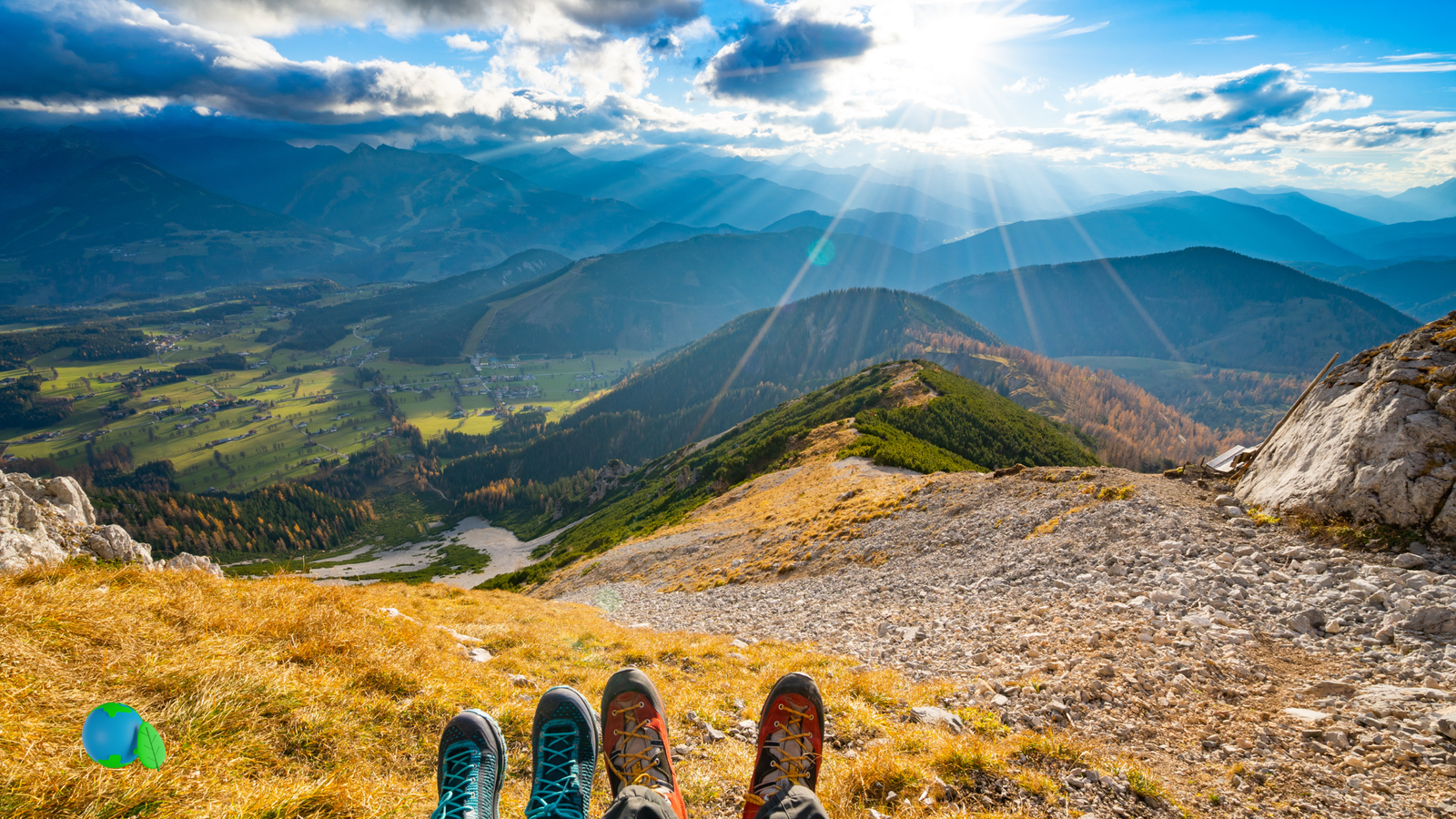
Practical guides for sustainable travel for digital nomads: rail-first routes, lighter packing, and low-impact stays. Start with the Start Here roadmap or jump into the Tools hub. Sustainable travel for digital nomads is no longer a niche idea – it is quickly becoming the foundation of mindful, low-impact exploration. At Eco Nomad Travel, you will find practical guides and tools that help you plan sustainable travel for digital nomads: choosing rail-first routes, packing lighter, and supporting local communities while you work remotely. Begin with our Start Here roadmap, explore the full Sustainable Travel Tools hub – including our carbon footprint calculator plus live currency and crypto converters – and see exactly how we review routes and stays on our Why You Can Trust Eco Nomad Travel methodology page. Each article combines up-to-date sustainability research with real-world route planning so you can explore slower, smarter, and with a smaller footprint.

Sustainable Travel for Digital Nomads: Smarter, Lower-Impact Ways to Work and Explore

Sustainable travel for digital nomads is no longer a niche idea – it is quickly becoming the foundation of mindful, low-impact exploration. At Eco Nomad Travel, you will find practical guides and tools that help you plan sustainable travel for digital nomads with practical eco-conscious travel options, smarter rail-first routes, lighter packing strategies, and community-friendly ways to work remotely. Our resources also support readers looking for eco-friendly travel for digital nomads and eco-conscious travel for digital nomads without sacrificing comfort or flexibility. Begin with our Start Here roadmap, explore the full Sustainable Travel Tools hub – including our carbon footprint calculator plus live currency and crypto converters – and see exactly how we review routes and stays on our Why You Can Trust Eco Nomad Travel methodology page. Each article combines up-to-date sustainability research with real-world route planning so you can explore slower, smarter, and with a smaller footprint.

Affiliate disclosure: If you book through this widget, Eco Nomad Travel may earn a small commission at no extra cost to you.

#eco-home-top .cta-trust{ margin:18px 0 18px; } #eco-home-top .cta-trust__panel{ border:1px solid #dbe7f5; border-radius:24px; background:linear-gradient(180deg,#ffffff 0%, #f8fbff 100%); box-shadow:0 18px 42px rgba(15,23,42,.10), 0 8px 20px rgba(15,23,42,.06); overflow:hidden; } #eco-home-top .cta-trust__top{ display:grid; grid-template-columns:1.05fr .95fr; gap:16px; padding:20px; align-items:start; } #eco-home-top .cta-trust__top h2{ margin:0 0 8px; color:#0f172a; font-weight:950; line-height:1.12; font-size:clamp(1.3rem,1.05rem + .9vw,1.8rem); letter-spacing:-.02em; } #eco-home-top .cta-trust__top p{ margin:0; color:#475569; line-height:1.7; font-size:1rem; } #eco-home-top .btn-blue{ display:inline-flex; align-items:center; justify-content:center; margin-top:14px; padding:11px 16px; border-radius:999px; background:linear-gradient(180deg,#2563eb,#1d4ed8); color:#fff; font-weight:950; text-decoration:none; box-shadow:0 10px 22px rgba(37,99,235,.22); white-space:nowrap; width:fit-content; max-width:100%; transition:transform .12s ease, filter .12s ease; } #eco-home-top .btn-blue:hover{ filter:brightness(1.03); transform:translateY(-1px); text-decoration:none; } #eco-home-top .cta-trust__meta{ border:1px solid #dbe7f5; border-radius:18px; background:linear-gradient(180deg,#ffffff 0%, #f9fbff 100%); box-shadow:0 8px 20px rgba(15,23,42,.05); padding:14px; } #eco-home-top .cta-trust__meta h3{ margin:0 0 10px; color:#0f172a; font-size:1rem; font-weight:950; line-height:1.2; } #eco-home-top .cta-trust__meta p{ margin:0 0 12px; color:#64748b; font-size:.92rem; line-height:1.55; } #eco-home-top .socials{ display:flex; flex-wrap:wrap; gap:8px; } #eco-home-top .socials a{ display:inline-flex; align-items:center; justify-content:center; padding:8px 11px; border-radius:999px; border:1px solid #dbe7f5; background:#ffffff; color:#0f172a; text-decoration:none; font-weight:900; font-size:.84rem; line-height:1.1; box-shadow:0 4px 10px rgba(15,23,42,.04); transition:all .12s ease; white-space:nowrap; } #eco-home-top .socials a:hover{ background:#eef5ff; color:#1d4ed8; border-color:#bfd4ff; text-decoration:none; transform:translateY(-1px); } #eco-home-top .cta-trust__bottom{ border-top:1px solid #dbe7f5; padding:16px 20px 18px; background:#ffffff; } #eco-home-top .cta-trust__bottom h3{ margin:0 0 6px; font-size:1.06rem; font-weight:950; color:#0f172a; line-height:1.2; } #eco-home-top .cta-trust__bottom p{ margin:0; color:#475569; line-height:1.7; } #eco-home-top .cta-trust__links{ margin-top:9px; font-weight:900; line-height:1.6; } #eco-home-top .cta-trust__links a{ color:#2563eb; text-decoration:none; } #eco-home-top .cta-trust__links a:hover{ text-decoration:underline; } #eco-home-top .quicklinks{ margin-top:10px; padding-top:10px; border-top:1px dashed #dbe7f5; color:#64748b; font-size:.94rem; line-height:1.65; } #eco-home-top .quicklinks a{ color:#2563eb; font-weight:900; text-decoration:none; } #eco-home-top .quicklinks a:hover{ text-decoration:underline; } @media (max-width:900px){ #eco-home-top .cta-trust__top{ grid-template-columns:1fr; } #eco-home-top .btn-blue{ width:100%; white-space:normal; } }

Start Your Sustainable Travel Journey

Plan rail-first routes, lighter packing, sustainable stays, eco-friendly city breaks, and low-impact adventures with research-backed guides from Eco Nomad Travel.

Explore Eco-Friendly Guides →

Connect With Eco Nomad Travel

Follow our sustainable travel content, eco-tourism ideas, digital nomad guides, and low-impact travel resources across all platforms.

Why Travelers Trust Eco Nomad Travel

Eco Nomad Travel is edited by Jeremy Jarvis. We publish rail-first, low-impact guides and tools for sustainable travel for digital nomads, using verified data, practical planning frameworks, and real-world trade-offs around time, budget, comfort, and emissions.

How to Plan Sustainable Travel for Digital Nomads and Remote Workers in 2026

Plan lower-impact trips without losing comfort. Our guides help you create sustainable travel for digital nomads and sustainable travel for remote workers with practical eco-conscious travel options, rail-first itineraries, verified eco-stays, and lighter packing strategies. It is a smarter approach to eco-friendly travel for digital nomads and more flexible, eco-conscious travel for digital nomads exploring Asia and Europe with a smaller footprint.

  • Night trains & rail passes: route ideas that replace short-haul flights with sleep-while-you-move comfort.
  • Stay choices that matter: walkable areas, refill-ready neighborhoods, and verified eco policies for lower-impact trips.
  • Minimalist packing: durable gear, refill kits, and zero-waste habits that work for long-term travel and remote work.
Sunset at Bali temple gates — a sustainable, slow-travel destination
Coastal slow-travel scene for sustainable tourism
Eco tents in a coastal forest — light-footprint camping
#eco-home-top .eco-container.ent-intro,#eco-home-top .ent-intro{ max-width: 1360px !important; width: 100% !important; margin-left: auto !important; margin-right: auto !important; padding-left: 16px !important; padding-right: 16px !important;}#eco-home-top .ent-intro__inner{ width: 100% !important; max-width: 100% !important;}@media (max-width: 640px){ #eco-home-top .eco-container.ent-intro, #eco-home-top .ent-intro{ padding-left: 12px !important; padding-right: 12px !important; }}
2025 Travel Carbon Footprint

Plan a Lower-Carbon Trip with Our Travel Footprint Calculator

See the climate impact of your next journey before you book. The Eco Nomad Travel calculator compares flights, trains, coaches and ferries so you can build a lower-emission, rail-first itinerary in a few clicks.

  • Estimate CO₂ for each segment and your whole trip.
  • Compare flight routes with rail and coach alternatives.
  • Adjust distance, class and modes to test “what if” scenarios.

Free to use, no signup. Built for rail-first, refill-friendly, low-impact trips in 2025.

Screenshot of Eco Nomad Travel's 2025 travel carbon footprint calculator showing segments and CO₂ results.
/* ========================= FINAL WIDTH UNIFIER (PASTE LAST) Makes EVERY section use the SAME width: – eco-container – eco-bleed__inner – hero wrap (ent-hero-wrap)========================= *//* 1) Single source of truth */#eco-home-top{ –eco-wrap: 1360px !important; } /* change to 1360 if you want *//* 2) Force BOTH systems to the same width */#eco-home-top .eco-container{ max-width: var(–eco-wrap) !important;}#eco-home-top .eco-bleed__inner{ max-width: var(–eco-wrap) !important; margin: 0 auto !important; padding: 0 var(–eco-pad) !important;}/* 3) Remove the rogue 1140px cap on the hero and intro widget card */#eco-home-top .ent-hero-wrap,#eco-home-top .eco-intro-tools{ max-width: var(–eco-wrap) !important; margin-left: auto !important; margin-right: auto !important;}/* 4) Ensure hero image actually spans the same width as the rest */#eco-home-top .ent-hero-img{ width: 100% !important; height: auto !important; display: block !important;}/* 5) Kill the extra “ent-hero-neon” rules (they’re conflicting and unnecessary) */#ent-hero-neon{ all: unset !important; }/* ===== FINAL HERO + TOP SECTION VISUAL UNIFIER ===== *//* one shared width */#eco-home-top{ –eco-wrap: 1360px !important; –eco-radius-xl: 24px; –eco-radius-lg: 20px; –eco-line: #e2e8f0; –eco-shadow: 0 18px 42px rgba(15,23,42,.10), 0 8px 20px rgba(15,23,42,.06);}/* same width for all major wrappers */#eco-home-top .eco-container,#eco-home-top .eco-bleed__inner,#eco-home-top .ent-hero-wrap,#eco-home-top .eco-intro-tools{ max-width: var(–eco-wrap) !important; margin-left: auto !important; margin-right: auto !important;}/* consistent side padding */#eco-home-top .eco-container,#eco-home-top .eco-bleed__inner,#eco-home-top .ent-hero-wrap,#eco-home-top .eco-intro-tools{ padding-left: 16px !important; padding-right: 16px !important;}@media (max-width:640px){ #eco-home-top .eco-container, #eco-home-top .eco-bleed__inner, #eco-home-top .ent-hero-wrap, #eco-home-top .eco-intro-tools{ padding-left: 12px !important; padding-right: 12px !important; }}/* main hero wrapper */#eco-home-top .ent-hero-wrap{ max-width: var(–eco-wrap) !important; margin: 0 auto 20px !important;}/* main hero image */#eco-home-top .ent-hero-img{ display: block !important; width: 100% !important; height: auto !important; border-radius: var(–eco-radius-xl) !important; border: 1px solid var(–eco-line) !important; box-shadow: var(–eco-shadow) !important; outline: none !important;}/* intro card */#eco-home-top .eco-intro-tools .eco-card{ border-radius: var(–eco-radius-xl) !important; border: 1px solid var(–eco-line) !important; box-shadow: var(–eco-shadow) !important; background: #ffffff !important; overflow: hidden !important;}/* tools strip */#eco-home-top .eco-tools-strip{ border-radius: 24px !important; border: 1.5px solid rgba(37,99,235,.30) !important; box-shadow: 0 18px 42px rgba(15,23,42,.10), 0 8px 20px rgba(15,23,42,.06), 0 0 0 1px rgba(37,99,235,.06) !important; background: linear-gradient(180deg,#f8fbff 0%, #ffffff 100%) !important;}/* trust panel */#eco-home-top .cta-trust__panel{ border-radius: var(–eco-radius-xl) !important; border: 1px solid var(–eco-line) !important; box-shadow: var(–eco-shadow) !important; background: linear-gradient(180deg,#ffffff 0%, #f8fbff 100%) !important; overflow: hidden !important;}/* planning block */#eco-home-top .ent-intro__inner{ border-radius: var(–eco-radius-xl) !important; border: 1px solid var(–eco-line) !important; box-shadow: var(–eco-shadow) !important; background: linear-gradient(180deg,#ffffff 0%, #f8fbff 100%) !important; padding: 18px !important;}/* media cards inside planning block */#eco-home-top .media-card{ border-radius: var(–eco-radius-lg) !important; border: 1px solid var(–eco-line) !important; box-shadow: 0 10px 22px rgba(15,23,42,.08) !important; overflow: hidden !important; background: #ffffff !important;}/* carbon block */#eco-home-top .carbon{ border-radius: var(–eco-radius-xl) !important; border: 1px solid var(–eco-line) !important; box-shadow: var(–eco-shadow) !important; background: linear-gradient(180deg,#f7faff 0%, #ffffff 100%) !important;}/* carbon image card */#eco-home-top .carbon figure{ border-radius: var(–eco-radius-lg) !important; border: 1px solid var(–eco-line) !important; box-shadow: 0 10px 22px rgba(15,23,42,.08) !important; overflow: hidden !important; background: #ffffff !important;}@media (max-width:640px){ #eco-home-top .ent-hero-img, #eco-home-top .eco-intro-tools .eco-card, #eco-home-top .eco-tools-strip, #eco-home-top .cta-trust__panel, #eco-home-top .ent-intro__inner, #eco-home-top .carbon{ border-radius: 20px !important; } #eco-home-top .media-card, #eco-home-top .carbon figure{ border-radius: 16px !important; }}#eco-home-top .ent-hero-img{ display:block !important; width:100% !important; height:auto !important; border-radius:24px !important; border:1px solid rgba(226,232,240,.95) !important; outline: 1px solid rgba(56,189,248,.28) !important; box-shadow: 0 18px 42px rgba(15,23,42,.10), 0 8px 20px rgba(15,23,42,.06), 0 0 18px rgba(56,189,248,.22), 0 0 42px rgba(59,130,246,.14) !important;}

Sustainable Travel for Digital Nomads, Slow Travel, Rail-First Trips, and Low-Impact Travel

Sustainable travel for digital nomads means practical choices that protect your time, budget, workflow, and the places you visit: stay longer, move slower when it makes sense, choose rail-first travel when practical, and build a remote-work setup that stays reliable on the road. Start with our Night Trains in Europe guide and these low-impact travel habits.

Low-impact travel viewpoint at golden hour for sustainable travel and slow travel inspiration
Low-impact travel for digital nomads: longer stays, lighter routes, local respect, and smarter planning.

Quick Start Checklist for Sustainable Travel

  • Pick a base: choose one neighborhood you can actually live and work from.
  • Choose a lower-impact route: prioritize trains, coaches, ferries, and fewer hops overall.
  • Stay longer: fewer check-ins, less transit churn, better work rhythm, and lower impact per day.

Remote-Work Ready Travel Setup

  • Connectivity: use an eSIM or SIM backup and set realistic Wi-Fi expectations.
  • Work spots: look for quiet cafés, coworking options, and good local etiquette.
  • Pack lighter: use a carry-on mindset with durable, multi-use gear and low-waste essentials.

Local-First, Eco-Friendly Travel Habits

We prioritize locally owned stays, neighborhood businesses, transit-friendly areas, and respectful cultural travel. For us, low-impact travel includes community respect, slower itineraries, and spending choices that keep more value local.

Slow Travel, Timing, and Better Pacing

Shoulder-season planning, deep-work days vs. adventure days, and base cities that reduce commuting all make sustainable travel for digital nomads more realistic. For destination ideas, see top sustainable digital nomad destinations for 2025.

#sustainable-nomad-travel{ –blue:#1e73be; –blue2:#155a96; –ink:#0f172a; –dim:#475569; –bg:#f7fbff; –ring:#dbe7ff; –card:#ffffff; –shadow:0 16px 40px rgba(15,23,42,.08); background:transparent; margin:26px auto; padding:0 14px; max-width:var(–wp–style–global–wide-size, 1234px);}#sustainable-nomad-travel,#sustainable-nomad-travel *{ box-sizing:border-box;}#sustainable-nomad-travel .ent-shell{ background:linear-gradient(180deg,#ffffff 0%, #f8fbff 100%); border:1px solid var(–ring); border-radius:24px; box-shadow:var(–shadow); overflow:hidden;}#sustainable-nomad-travel .ent-inner{ max-width:none; margin:0 auto; padding:20px 18px 20px;}#sustainable-nomad-travel .ent-head h2{ margin:0 0 8px; color:var(–ink); font-weight:900; font-size:clamp(1.45rem, 1.05rem + 1.35vw, 2rem); line-height:1.12; letter-spacing:-0.02em;}#sustainable-nomad-travel .ent-lede{ margin:0 0 12px; color:var(–dim); font-size:clamp(1rem, .95rem + .25vw, 1.05rem); max-width:980px;}#sustainable-nomad-travel .ent-cta{ display:flex; flex-wrap:wrap; gap:10px; margin:10px 0 14px;}#sustainable-nomad-travel .ent-btn{ display:inline-flex; align-items:center; justify-content:center; padding:10px 16px; border-radius:14px; background:linear-gradient(180deg,var(–blue),var(–blue2)); color:#fff; font-weight:900; text-decoration:none; border:1px solid rgba(255,255,255,.15); box-shadow:0 12px 24px rgba(21,90,150,.16);}#sustainable-nomad-travel .ent-btn:hover{ filter:brightness(1.03); text-decoration:none;}#sustainable-nomad-travel .ent-btn–ghost{ background:#e8f1ff; color:var(–ink); border:1px solid rgba(30,115,190,.18); box-shadow:none;}#sustainable-nomad-travel .ent-hero{ margin:8px 0 12px; border:1px solid var(–ring); border-radius:18px; background:#eef5ff; overflow:hidden; box-shadow:0 8px 20px rgba(15,23,42,.04);}#sustainable-nomad-travel .ent-hero img{ display:block; width:100%; height:auto; max-height:340px; object-fit:cover;}#sustainable-nomad-travel .ent-hero figcaption{ padding:10px 12px; font-size:.9rem; color:#274160; background:#f8fbff;}#sustainable-nomad-travel .ent-toc{ display:flex; flex-wrap:wrap; gap:8px; margin:10px 0 12px;}#sustainable-nomad-travel .ent-toc a{ padding:6px 10px; border-radius:999px; background:#f3f8ff; border:1px solid var(–ring); color:var(–ink); font-weight:800; text-decoration:none; font-size:.9rem;}#sustainable-nomad-travel .ent-toc a:hover{ background:#eaf2ff; text-decoration:none;}#sustainable-nomad-travel .ent-grid{ display:grid; gap:12px; grid-template-columns:repeat(2, minmax(0, 1fr));}#sustainable-nomad-travel .ent-card{ background:var(–card); border:1px solid var(–ring); border-radius:16px; padding:14px; box-shadow:0 8px 22px rgba(15,23,42,.04);}#sustainable-nomad-travel .ent-card h3{ margin:0 0 6px; color:var(–ink); font-weight:900; font-size:1.04rem; line-height:1.2; letter-spacing:-0.01em;}#sustainable-nomad-travel .ent-card p{ margin:0; color:#223;}#sustainable-nomad-travel .ent-list{ margin:0; padding:0 0 0 18px;}#sustainable-nomad-travel .ent-list li{ margin:.35rem 0;}#sustainable-nomad-travel .ent-related{ margin-top:14px; border:1px solid var(–ring); border-radius:16px; background:#fff; padding:14px; box-shadow:0 8px 22px rgba(15,23,42,.04);}#sustainable-nomad-travel .ent-related-h{ margin:0 0 8px; color:var(–ink); font-weight:900; font-size:1.05rem;}#sustainable-nomad-travel .ent-related-ul{ margin:0; padding:0 0 0 18px;}#sustainable-nomad-travel .ent-related-ul li{ margin:.35rem 0;}#sustainable-nomad-travel a{ color:var(–blue); font-weight:800;}#sustainable-nomad-travel :is(#ent-start,#ent-remote,#ent-local,#ent-pace){ scroll-margin-top:80px;}@media (max-width:720px){ #sustainable-nomad-travel{ padding:0 10px; margin:18px auto; } #sustainable-nomad-travel .ent-inner{ padding:16px 14px 16px; } #sustainable-nomad-travel .ent-grid{ grid-template-columns:1fr; } #sustainable-nomad-travel .ent-hero img{ max-height:260px; } #sustainable-nomad-travel .ent-cta{ flex-direction:column; } #sustainable-nomad-travel .ent-btn{ width:100%; }}#sustainable-nomad-travel{ –blue:#1e73be; –blue2:#155a96; –ink:#0f172a; –dim:#475569; –bg:#f7fbff; –ring:#dbe7ff; –card:#ffffff; –shadow:0 16px 40px rgba(15,23,42,.08); background:transparent; margin:26px auto; padding:0 14px; max-width:1360px !important; width:100% !important;}#sustainable-nomad-travel .ent-inner{ max-width:none; margin:0 auto; padding:20px 22px 20px;}/* Force CTA buttons to render correctly on live page */#sustainable-nomad-travel .ent-cta .ent-btn,#sustainable-nomad-travel .ent-cta a.ent-btn{ display:inline-flex !important; align-items:center !important; justify-content:center !important; padding:10px 16px !important; border-radius:14px !important; text-decoration:none !important; font-weight:900 !important; line-height:1.1 !important; border:1px solid transparent !important; color:#ffffff !important; background:linear-gradient(180deg,#1e73be,#155a96) !important; box-shadow:0 12px 24px rgba(21,90,150,.16) !important;}#sustainable-nomad-travel .ent-cta .ent-btn:hover,#sustainable-nomad-travel .ent-cta a.ent-btn:hover{ color:#ffffff !important; filter:brightness(1.03) !important; text-decoration:none !important;}#sustainable-nomad-travel .ent-cta .ent-btn–ghost,#sustainable-nomad-travel .ent-cta a.ent-btn–ghost{ background:#e8f1ff !important; color:#0f172a !important; border:1px solid rgba(30,115,190,.18) !important; box-shadow:none !important;}#sustainable-nomad-travel .ent-cta .ent-btn–ghost:hover,#sustainable-nomad-travel .ent-cta a.ent-btn–ghost:hover{ background:#dbeafe !important; color:#0f172a !important;}#sustainable-nomad-travel{ –blue:#1e73be; –blue2:#155a96; –ink:#0f172a; –dim:#475569; –bg:#f7fbff; –ring:#dbe7ff; –card:#ffffff; –shadow:0 16px 40px rgba(15,23,42,.08); background:transparent; margin:26px auto; padding:0 14px; max-width:1360px !important; width:100% !important;}@media (max-width:720px){ #sustainable-nomad-travel{ margin:18px auto !important; padding:0 8px !important; max-width:none !important; width:100% !important; } #sustainable-nomad-travel .ent-inner{ padding:16px 14px !important; } #sustainable-nomad-travel .ent-grid{ grid-template-columns:1fr !important; } #sustainable-nomad-travel .ent-cta{ flex-direction:column; } #sustainable-nomad-travel .ent-cta .ent-btn, #sustainable-nomad-travel .ent-cta a.ent-btn{ width:100% !important; }}
#eco-home-hub-2025, #eco-home-hub-2025 *{box-sizing:border-box} #eco-home-hub-2025{ –ink:#0f172a; –muted:#475569; –line:#dbe7f5; –panel:#ffffff; –soft:#f7fbff; –soft2:#eef7f5; –blue:#1e73be; –blue2:#155a96; –green:#0b7a75; –shadow:0 16px 40px rgba(15,23,42,.08); –r:20px; –content:var(–wp–style–global–wide-size, var(–wp–style–global–content-size, 1180px)); max-width:var(–content); margin:26px auto; padding:0 14px; color:var(–ink); font-family:system-ui,-apple-system,Segoe UI,Roboto,Inter,Arial,sans-serif; line-height:1.75; overflow-x:clip; } #eco-home-hub-2025 a{color:var(–blue);text-decoration:none} #eco-home-hub-2025 a:hover{text-decoration:underline} #eco-home-hub-2025 .hub-shell{ background:linear-gradient(180deg,#ffffff 0%, #f8fbff 100%); border:1px solid var(–line); border-radius:24px; box-shadow:var(–shadow); overflow:hidden; } #eco-home-hub-2025 .hub-hero{ padding:22px 20px 18px; background: radial-gradient(900px 260px at 0% 0%, rgba(30,115,190,.10) 0%, rgba(30,115,190,0) 60%), radial-gradient(800px 240px at 100% 0%, rgba(11,122,117,.10) 0%, rgba(11,122,117,0) 58%), linear-gradient(180deg,#ffffff 0%, #f7fbff 100%); border-bottom:1px solid var(–line); } #eco-home-hub-2025 .eyebrow{ display:inline-flex; align-items:center; gap:8px; margin:0 0 10px; padding:6px 10px; border-radius:999px; background:#eaf4ff; color:var(–blue2); font-size:.76rem; font-weight:900; letter-spacing:.04em; text-transform:uppercase; } #eco-home-hub-2025 h2{ margin:0 0 10px; font-size:clamp(1.55rem,1.2rem + 1.4vw,2.3rem); line-height:1.12; letter-spacing:-.02em; font-weight:900; color:var(–ink); } #eco-home-hub-2025 .hub-lede{ margin:0 0 12px; color:var(–muted); font-size:1rem; max-width:1360px; } #eco-home-hub-2025 .hub-cta-row{ display:flex; flex-wrap:wrap; gap:10px; margin-top:12px; } #eco-home-hub-2025 .hub-btn, #eco-home-hub-2025 .hub-btn-ghost{ display:inline-flex; align-items:center; justify-content:center; min-height:44px; padding:11px 16px; border-radius:14px; font-size:.95rem; font-weight:900; text-decoration:none; transition:transform .12s ease, filter .12s ease, background .12s ease; } #eco-home-hub-2025 .hub-btn{ color:#fff; background:linear-gradient(180deg,var(–blue),var(–blue2)); box-shadow:0 12px 24px rgba(21,90,150,.18); } #eco-home-hub-2025 .hub-btn:hover{ transform:translateY(-1px); filter:brightness(1.03); text-decoration:none; } #eco-home-hub-2025 .hub-btn-ghost{ color:var(–ink); background:#eef4ff; border:1px solid rgba(30,115,190,.18); } #eco-home-hub-2025 .hub-btn-ghost:hover{ background:#e5efff; text-decoration:none; } #eco-home-hub-2025 .hub-body{ padding:18px 20px 20px; } #eco-home-hub-2025 .hub-grid{ display:grid; grid-template-columns:minmax(0,1.55fr) minmax(300px,.95fr); gap:16px; align-items:start; } #eco-home-hub-2025 .hub-main, #eco-home-hub-2025 .hub-side{ min-width:0; } #eco-home-hub-2025 .hub-card{ background:var(–panel); border:1px solid var(–line); border-radius:18px; padding:16px; box-shadow:0 8px 24px rgba(15,23,42,.04); } #eco-home-hub-2025 .hub-card + .hub-card{margin-top:14px} #eco-home-hub-2025 h3{ margin:0 0 8px; font-size:1.08rem; line-height:1.2; font-weight:900; color:#0f172a; letter-spacing:-.01em; } #eco-home-hub-2025 p{margin:0 0 12px} #eco-home-hub-2025 .small{font-size:.94rem;color:var(–muted)} #eco-home-hub-2025 .tiny{font-size:.82rem;color:var(–muted);margin-top:10px} #eco-home-hub-2025 .hub-checks, #eco-home-hub-2025 .hub-list{ margin:10px 0 0; padding-left:18px; } #eco-home-hub-2025 .hub-list li, #eco-home-hub-2025 .hub-checks li{margin:.38rem 0} #eco-home-hub-2025 .hub-checks{ list-style:none; padding-left:0; } #eco-home-hub-2025 .hub-checks li{ position:relative; padding-left:22px; } #eco-home-hub-2025 .hub-checks li::before{ content:”✓”; position:absolute; left:0; top:0; color:var(–blue); font-weight:900; } #eco-home-hub-2025 .hub-chips{ display:flex; flex-wrap:wrap; gap:8px; margin-top:10px; } #eco-home-hub-2025 .chip{ display:inline-flex; align-items:center; padding:7px 10px; border-radius:999px; background:#f8fbff; border:1px solid var(–line); color:#1e293b; font-size:.88rem; font-weight:800; text-decoration:none; line-height:1.2; } #eco-home-hub-2025 .chip:hover{ background:#eef5ff; text-decoration:none; } #eco-home-hub-2025 .hub-highlight{ background:linear-gradient(180deg,var(–soft) 0%, #ffffff 100%); } #eco-home-hub-2025 .hub-split{ display:grid; grid-template-columns:repeat(2,minmax(0,1fr)); gap:12px; margin-top:10px; } #eco-home-hub-2025 .mini{ background:#f8fbff; border:1px solid var(–line); border-radius:14px; padding:12px; } #eco-home-hub-2025 .mini strong{ display:block; margin-bottom:4px; color:var(–blue2); } #eco-home-hub-2025 .hub-stat-grid{ display:grid; grid-template-columns:repeat(2,minmax(0,1fr)); gap:10px; margin-top:10px; } #eco-home-hub-2025 .stat{ border:1px solid var(–line); background:#fff; border-radius:14px; padding:12px; font-size:.9rem; line-height:1.45; } #eco-home-hub-2025 .stat strong{ display:block; margin-bottom:4px; color:var(–green); } #eco-home-hub-2025 .hub-tool-row{ display:flex; flex-wrap:wrap; gap:10px; margin-top:12px; } #eco-home-hub-2025 .hub-tool{ display:inline-flex; align-items:center; justify-content:center; min-height:40px; padding:10px 12px; border-radius:12px; background:linear-gradient(180deg,var(–blue),var(–blue2)); color:#fff; text-decoration:none; font-size:.9rem; font-weight:900; line-height:1.1; } #eco-home-hub-2025 .hub-tool:hover{ filter:brightness(1.03); text-decoration:none; } #eco-home-hub-2025 .hub-recent{ display:grid; gap:10px; margin-top:10px; } #eco-home-hub-2025 .rec{ display:block; padding:10px 12px; border-radius:12px; border:1px solid var(–line); background:#f8fbff; color:#111827; text-decoration:none; font-weight:900; line-height:1.28; } #eco-home-hub-2025 .rec:hover{ background:#eef5ff; text-decoration:none; } #eco-home-hub-2025 .trust-note{ margin-top:14px; padding:14px; background:linear-gradient(135deg,#f7fbff 0%, #eef7f5 100%); border:1px solid var(–line); border-radius:16px; } @media (max-width:980px){ #eco-home-hub-2025 .hub-grid{grid-template-columns:1fr} #eco-home-hub-2025 .hub-split, #eco-home-hub-2025 .hub-stat-grid{grid-template-columns:1fr} } @media (max-width:640px){ #eco-home-hub-2025{ padding:0 10px; margin:18px auto; } #eco-home-hub-2025 .hub-hero, #eco-home-hub-2025 .hub-body{ padding-left:14px; padding-right:14px; } #eco-home-hub-2025 .hub-cta-row{ flex-direction:column; } #eco-home-hub-2025 .hub-btn, #eco-home-hub-2025 .hub-btn-ghost, #eco-home-hub-2025 .hub-tool{ width:100%; } } @media (prefers-reduced-motion:reduce){ #eco-home-hub-2025 .hub-btn, #eco-home-hub-2025 .hub-btn-ghost{ transition:none; } } #eco-home-hub-2025{ –ink:#0f172a; –muted:#475569; –line:#dbe7f5; –panel:#ffffff; –soft:#f7fbff; –soft2:#eef7f5; –blue:#1e73be; –blue2:#155a96; –green:#0b7a75; –shadow:0 16px 40px rgba(15,23,42,.08); –r:20px; –content:1360px; max-width:var(–content); width:100%; margin:26px auto; padding:0 14px; color:var(–ink); font-family:system-ui,-apple-system,Segoe UI,Roboto,Inter,Arial,sans-serif; line-height:1.75; overflow-x:clip;}@media (max-width:640px){ #eco-home-hub-2025{ width:100% !important; max-width:none !important; margin:18px auto !important; padding:0 6px !important; } #eco-home-hub-2025 .hub-shell{ border-radius:18px !important; } #eco-home-hub-2025 .hub-hero, #eco-home-hub-2025 .hub-body{ padding-left:14px !important; padding-right:14px !important; } #eco-home-hub-2025 .hub-cta-row{ flex-direction:column; } #eco-home-hub-2025 .hub-btn, #eco-home-hub-2025 .hub-btn-ghost, #eco-home-hub-2025 .hub-tool{ width:100%; }}@media (max-width: 767px){ #sustainable-nomad-travel, #eco-home-hub-2025{ width: auto !important; max-width: none !important; margin-left: -10px !important; margin-right: -10px !important; padding-left: 10px !important; padding-right: 10px !important; } #sustainable-nomad-travel .ent-shell, #eco-home-hub-2025 .hub-shell{ width: 100% !important; max-width: none !important; } #sustainable-nomad-travel .ent-inner{ padding: 16px 14px !important; } #eco-home-hub-2025 .hub-hero, #eco-home-hub-2025 .hub-body{ padding-left: 14px !important; padding-right: 14px !important; }}@media (max-width: 767px){ #sustainable-nomad-travel, #eco-home-hub-2025{ position: relative !important; left: 50% !important; right: 50% !important; width: 100vw !important; max-width: 100vw !important; margin-left: -50vw !important; margin-right: -50vw !important; padding-left: 8px !important; padding-right: 8px !important; box-sizing: border-box !important; } #sustainable-nomad-travel .ent-shell, #eco-home-hub-2025 .hub-shell{ width: 100% !important; max-width: none !important; }}@media (max-width: 767px){ html, body{ overflow-x: hidden; } #sustainable-nomad-travel, #eco-home-hub-2025{ position: relative !important; left: 50% !important; width: 100vw !important; max-width: 100vw !important; margin-left: -50vw !important; padding-left: 8px !important; padding-right: 8px !important; box-sizing: border-box !important; } #sustainable-nomad-travel .ent-shell, #eco-home-hub-2025 .hub-shell{ width: 100% !important; max-width: none !important; } #sustainable-nomad-travel .ent-inner{ padding: 16px 14px !important; } #eco-home-hub-2025 .hub-hero, #eco-home-hub-2025 .hub-body{ padding-left: 14px !important; padding-right: 14px !important; }}
Eco Nomad Travel Hub

Sustainable Travel for Digital Nomads, Rail-First Trips, Eco Travel Tips, and Low-Impact Travel Planning in 2026

Welcome to Eco Nomad Travel, your home for sustainable travel for digital nomads, eco travel tips, low-impact travel habits, rail-first itineraries, zero-waste packing, car-free workation cities, green travel tools, and practical eco-conscious travel options for travelers who want smarter, slower, and more responsible journeys in 2026.

Start here if you want help with sustainable travel planning, train travel in Europe, carbon-neutral travel strategies, eco-friendly travel gear, sustainable stays, digital nomad destinations, and real-world travel systems that balance comfort, cost, and lower emissions.

Start with the core sustainable travel guides

These cornerstone resources cover the biggest topics readers search for: sustainable travel guide 2026, train vs plane emissions, night trains in Europe, book sleeper trains, zero-waste packing list, and green travel guide.

How to plan a lower-carbon, lower-stress trip

The strongest eco-friendly travel planning strategy usually comes down to three things: choose a walkable base city, reduce travel hops, and prioritize rail travel, ferries, public transit, and longer stays over short, fragmented itineraries.

  • Choose destinations with strong public transit and car-free neighborhoods.
  • Compare train vs plane emissions before booking regional routes.
  • Stay longer to reduce transport emissions per day.
  • Use a reusable, zero-waste packing setup to cut single-use waste.
  • Book sustainable stays carefully and learn how to avoid greenwashing.

Sustainable travel for digital nomads in 2026

Sustainable travel for digital nomads is no longer just about choosing a greener destination. It is about creating a realistic lifestyle with fewer flights, more local transit, longer stays, smarter packing, and better daily systems. That means choosing places where you can work remotely without depending on ride-hails, constant moving, or waste-heavy routines.

Best foundation Start with a walkable city, reliable trains, refill-friendly routines, and accommodations near transit.
Best strategy Use one base for deeper exploration, then stack day trips and rail loops instead of adding flights.

Eco-travel trends and sustainable tourism data for 2026

The biggest eco-tourism trends in 2026 point toward slow travel, regenerative tourism, rail-linked destinations, long-stay travel, and stronger demand for car-free city breaks and low-impact digital nomad destinations.

Rail-first growth More travelers are comparing emissions, comfort, and total door-to-door time before booking regional flights.
Longer stays Long-stay travel reduces frequent transport hops and often leads to lower emissions per day.
Smarter packing Refillable toiletries, reusable kits, and lighter bags are becoming standard sustainable travel habits.
Transit-first cities Demand keeps rising for walkable destinations with strong public transit and less car dependence.

For deeper reading, explore Green Travel Guide 2026, What Is Sustainable Travel?, and Sustainability in Travel and Tourism.

Quick tools for planning sustainable travel

Before you book, use the planning tools and partner resources that best support your route. These are helpful for readers searching for travel carbon calculator, sustainable travel tools, best eSIM for travel, eco travel booking tools, and rail-first trip planning.

Affiliate disclosure: We may earn a commission if you book or buy through some partner links, never at extra cost to you.

.ent-hub-wrap{ –hub-wrap: 1360px; –hub-ink:#0f172a; –hub-text:#334155; –hub-muted:#64748b; –hub-line:#dbe7f5; –hub-blue:#2563eb; –hub-blue2:#1d4ed8; –hub-soft:#f8fbff; –hub-soft2:#eef6ff; –hub-shadow:0 18px 42px rgba(15,23,42,.10), 0 8px 20px rgba(15,23,42,.06); –hub-radius:24px; –hub-radius-md:18px; max-width:var(–hub-wrap); margin:22px auto; padding:0 16px; font-family:system-ui,-apple-system,Segoe UI,Roboto,Inter,Arial,sans-serif; color:var(–hub-text); } .ent-hub-wrap, .ent-hub-wrap *{ box-sizing:border-box; } .ent-hub{ margin:18px 0; padding:18px; border:1px solid var(–hub-line); border-radius:var(–hub-radius); background:linear-gradient(180deg,#ffffff 0%, var(–hub-soft) 100%); box-shadow:var(–hub-shadow); overflow:hidden; } .ent-hub .ent-badge{ display:inline-flex; align-items:center; gap:8px; padding:6px 11px; border-radius:999px; background:rgba(37,99,235,.10); border:1px solid rgba(37,99,235,.18); font-size:12px; font-weight:900; letter-spacing:.04em; text-transform:uppercase; color:#0f172a; margin-bottom:10px; } .ent-hub h2{ margin:0 0 8px; font-size:clamp(1.4rem,1.1rem + 1vw,2rem); line-height:1.12; letter-spacing:-.02em; color:var(–hub-ink); font-weight:950; } .ent-hub p{ margin:0 0 14px; font-size:1rem; line-height:1.65; color:var(–hub-text); max-width:980px; } .ent-grid{ display:grid; grid-template-columns:repeat(2,minmax(0,1fr)); gap:12px; margin:0; padding:0; list-style:none; } .ent-card{ min-width:0; } .ent-card a{ display:block !important; padding:14px 14px !important; border:1px solid rgba(37,99,235,.14) !important; border-radius:var(–hub-radius-md) !important; background:#ffffff !important; text-decoration:none !important; font-weight:800 !important; line-height:1.28 !important; color:var(–hub-ink) !important; box-shadow:0 8px 22px rgba(15,23,42,.05) !important; transition:transform .14s ease, box-shadow .14s ease, border-color .14s ease, background .14s ease; min-height:100%; } .ent-card a:hover, .ent-card a:focus{ outline:none; text-decoration:none !important; background:var(–hub-soft2) !important; border-color:rgba(37,99,235,.35) !important; box-shadow:0 12px 28px rgba(15,23,42,.10) !important; transform:translateY(-2px) !important; } .ent-meta{ display:block !important; margin-top:7px !important; font-size:13px !important; font-weight:700 !important; color:var(–hub-muted) !important; line-height:1.45 !important; } .ent-cta{ margin-top:16px; display:flex; flex-wrap:wrap; gap:10px; } .ent-btn{ display:inline-flex !important; align-items:center !important; justify-content:center !important; padding:11px 16px !important; border-radius:14px !important; background:linear-gradient(180deg,var(–hub-blue),var(–hub-blue2)) !important; color:#fff !important; text-decoration:none !important; font-weight:900 !important; line-height:1.1 !important; box-shadow:0 10px 22px rgba(37,99,235,.22) !important; border:1px solid transparent !important; transition:transform .14s ease, filter .14s ease; } .ent-btn:hover, .ent-btn:focus{ filter:brightness(1.03); transform:translateY(-1px); } .ent-btn.secondary{ background:#0f172a !important; box-shadow:0 10px 22px rgba(15,23,42,.16) !important; } @media (max-width:900px){ .ent-grid{ grid-template-columns:1fr; } } @media (max-width:640px){ .ent-hub-wrap{ padding:0 12px; margin:18px auto; } .ent-hub{ padding:16px 14px; border-radius:20px; } .ent-card a{ border-radius:16px !important; } .ent-cta{ flex-direction:column; } .ent-btn{ width:100%; } }
Start Here

Sustainable Travel for Digital Nomads: Low-Impact Guides, Eco-Conscious Travel Options, and Rail-First Planning

Start here for the core sustainable travel guides on Eco Nomad Travel. These are the best resources for low-impact travel, carbon-neutral travel, eco-friendly travel tips, digital nomad visas, remote work destinations, long-term travel packing, and other practical eco-conscious travel options. If you want practical steps for greener travel in 2025, this is the fastest path.

Browse

Browse Eco Nomad Travel by Category: Sustainable Destinations, Eco Tips, Transport, Packing, and Digital Nomad Guides

Browse the main content hubs for sustainable travel destinations, eco travel planning, green transport, gear and packing, digital nomad lifestyle, visas and workations, and other practical eco-conscious travel options. Each category is built to help readers find the most relevant low-impact travel resources quickly.

.ent-author-box{ max-width: 1360px; width: 100%; margin: 38px auto 20px; padding: 0 14px; box-sizing: border-box; } .ent-author-box *, .ent-author-box *::before, .ent-author-box *::after{ box-sizing:border-box; } .ent-author-box__inner{ display: grid; grid-template-columns: 92px 1fr; gap: 16px; align-items: center; background: linear-gradient(135deg, #f7fbff 0%, #eef7f5 100%); border: 1px solid #d6ebe6; border-radius: 20px; padding: 16px 18px; box-shadow: 0 20px 42px rgba(15, 23, 42, 0.12), 0 8px 18px rgba(11, 58, 120, 0.08); } .ent-author-box__image-wrap{ display: flex; align-items: center; justify-content: center; } .ent-author-box__image{ width: 80px; height: 80px; border-radius: 999px; object-fit: cover; display: block; border: 3px solid #ffffff; box-shadow: 0 10px 24px rgba(11, 58, 120, 0.16); } .ent-author-box__content{ min-width: 0; } .ent-author-box__eyebrow{ margin: 0 0 4px; font-size: 11px; font-weight: 800; letter-spacing: .08em; text-transform: uppercase; color: #0b7a75; } .ent-author-box__name{ margin: 0 0 8px; font-size: clamp(1.18rem, 2vw, 1.4rem); line-height: 1.12; color: #0f172a; } .ent-author-box__name a{ color: #0f172a; text-decoration: none; } .ent-author-box__name a:hover{ color: #0b3a78; text-decoration: underline; } .ent-author-box__bio{ margin: 0 0 8px; color: #334155; line-height: 1.6; font-size: 0.93rem; } .ent-author-box__bio a{ color: #0b7a75; text-decoration: none; font-weight: 600; } .ent-author-box__bio a:hover{ text-decoration: underline; } .ent-author-box__actions{ display: flex; flex-wrap: wrap; gap: 8px; margin: 10px 0 10px; } .ent-author-box__btn{ display: inline-flex; align-items: center; justify-content: center; min-height: 37px; padding: 8px 14px; border-radius: 999px; border: 1px solid #b9ddd6; background: #ffffff; color: #0b7a75; text-decoration: none; font-weight: 700; font-size: .87rem; transition: all .2s ease; } .ent-author-box__btn:hover{ background: #f3fbfa; text-decoration: none; } .ent-author-box__btn–primary{ background: #0b7a75; border-color: #0b7a75; color: #ffffff; } .ent-author-box__btn–primary:hover{ background: #096b67; border-color: #096b67; color: #ffffff; } .ent-author-box__socials{ display: flex; flex-wrap: wrap; gap: 6px 8px; margin-top: 2px; } .ent-author-box__socials a{ display: inline-flex; align-items: center; justify-content: center; padding: 6px 10px; border-radius: 999px; background: #ffffff; border: 1px solid #d6ebe6; color: #0b3a78; text-decoration: none; font-size: .8rem; font-weight: 700; line-height: 1.1; transition: all .2s ease; } .ent-author-box__socials a:hover{ background: #eef7ff; color: #0b7a75; text-decoration: none; } @media (max-width: 767px){ .ent-author-box{ margin: 30px auto 18px; padding: 0 10px; } .ent-author-box__inner{ grid-template-columns: 1fr; text-align: center; padding: 15px 14px; gap: 12px; } .ent-author-box__image{ width: 72px; height: 72px; } .ent-author-box__bio{ font-size: 0.91rem; line-height: 1.58; } .ent-author-box__actions{ justify-content: center; margin: 10px 0 8px; } .ent-author-box__socials{ justify-content: center; gap: 6px; } .ent-author-box__socials a{ font-size: .78rem; padding: 6px 9px; } }
Jeremy Jarvis — Eco Nomad Travel founder and sustainable travel writer

About the Author

Jeremy Jarvis

Jeremy Jarvis is the founder of Eco Nomad Travel, where he writes about sustainable travel, low-impact adventures, eco-friendly destinations, rail travel, digital nomad life, and practical ways to explore more responsibly without losing comfort or meaning.

Through destination guides, transport comparisons, sustainability content, and travel resources, he helps readers build smarter, greener, and more intentional journeys around the world.

/* Center the YouTube embed and make it responsive */.yt-center{ display:flex; justify-content:center; width:100%; margin:16px auto;}.yt-center iframe{ width:min(900px, 100%); aspect-ratio:16 / 9; height:auto; display:block; border:0; border-radius:14px; /* optional */}
Sustainable travel for digital nomads on a Maldives island with white sand and a bright blue ocean
A Maldives island with white sand and turquoise water—an ideal backdrop for sustainable travel for digital nomads.

Eco Nomad Travel FAQ: Sustainable Digital Nomad & Eco-Travel Questions (2026)

Quick answers about how Eco Nomad Travel works, how we choose sustainable routes and stays, and how you can use our low-impact travel guides, rail-first resources, and zero-waste packing lists to plan your own trips.

What is Eco Nomad Travel?

Eco Nomad Travel is an independent hub for sustainable travel tips, rail-first itineraries, and low-impact digital nomad guides. We focus on walkable base cities, night trains, refill-friendly habits, and practical, evidence-based advice rather than glossy marketing.

Do you sell or book trips?

No. Eco Nomad Travel is not a tour operator or travel agency. We publish independent guides, tools, and low-impact travel itineraries. Some links are affiliate links that help keep the content free, but we never charge you for bookings and your price stays the same.

How do you pick sustainable options?

We prioritise rail and night-train routes, walkable neighbourhoods, strong public transit, refill and reuse readiness, and verified eco policies or certifications. When possible we look for standards like GSTC-recognised programmes or EU Ecolabel, then cross-check them against real-world experiences and local context.

Where should I start on the site?

If you are new to Eco Nomad Travel, start with our cornerstone guides: Sustainable Travel Guide 2025, Green Travel Guide 2025, Eco Travel Places 2025, and Train vs Plane Emissions 2025. Together they give you a full overview of low-impact destinations, rail vs air and zero-waste packing.

How do affiliate links work on Eco Nomad Travel?

Some of our links to flights, stays, eSIMs and travel gear are affiliate links. If you book through them, Eco Nomad Travel may earn a small commission at no extra cost to you. We use this to support independent, ad-light content, and we only recommend partners that fit a rail-first, low-impact travel style.

/* Full-width band + inner container */.ent-home-faq{ width:100vw; margin-left:calc(50% – 50vw); margin-right:calc(50% – 50vw); background:#f6fbff; border-top:2px solid #1e73be; border-bottom:2px solid #1e73be;}.ent-home-faq__inner{ max-width:1200px; margin:0 auto; padding:32px 16px 34px;}.ent-home-faq h2{ text-align:center; margin:0 0 12px; font-weight:800; color:#0b0f19;}.ent-home-faq__intro{ max-width:780px; margin:0 auto 20px; text-align:center; font-size:0.97rem; color:#4b5563;}/* Accordion */.ent-faq{ background:#eef4ff; border:1px solid #cddcff; border-radius:12px; margin:10px 0; padding:0;}.ent-faq summary{ cursor:pointer; list-style:none; padding:11px 14px; display:flex; align-items:center; justify-content:space-between; font-weight:700; color:#0a1a3a;}.ent-faq summary::-webkit-details-marker{display:none;}.ent-faq__icon{ font-weight:800; font-size:0.95rem; color:#1e73be; transition:transform .18s ease;}.ent-faq[open] .ent-faq__icon{transform:rotate(90deg);}.ent-faq__a{ padding:0 14px 12px; font-size:0.95rem; color:#111827;}.ent-faq__a p{margin:8px 0 4px;}.ent-faq a{color:#1e73be;text-decoration:none;}.ent-faq a:hover{text-decoration:underline;}@media (max-width:640px){ .ent-home-faq__inner{padding:26px 14px 30px;}}{ “@context”: “https://schema.org”, “@type”: “FAQPage”, “@id”: “https://economadtravel.com/#homepage-faq”, “mainEntity”: [ { “@type”: “Question”, “name”: “What is Eco Nomad Travel?”, “acceptedAnswer”: { “@type”: “Answer”, “text”: “Eco Nomad Travel is an independent hub for sustainable travel tips, rail-first itineraries, and low-impact digital nomad guides focused on walkable base cities, night trains, and refill-friendly habits.” } }, { “@type”: “Question”, “name”: “Do you sell or book trips?”, “acceptedAnswer”: { “@type”: “Answer”, “text”: “No. Eco Nomad Travel is not a tour operator or travel agency. We publish independent guides, tools, and low-impact itineraries. Some links may be affiliate links that help support the site at no extra cost to you.” } }, { “@type”: “Question”, “name”: “How do you pick sustainable options?”, “acceptedAnswer”: { “@type”: “Answer”, “text”: “We prioritize rail and night-train routes, walkable neighborhoods, strong public transit, refill and reuse readiness, and verified eco policies or credible certifications. When possible, we cross-check claims against real-world route planning and local context.” } }, { “@type”: “Question”, “name”: “Where should I start on the site?”, “acceptedAnswer”: { “@type”: “Answer”, “text”: “Start with the cornerstone guides, including the Sustainable Travel Guide, Green Travel Guide, Eco Travel Places guide, and Train vs Plane Emissions guide. They cover low-impact destinations, rail vs air comparisons, and practical packing habits.” } }, { “@type”: “Question”, “name”: “How do affiliate links work on Eco Nomad Travel?”, “acceptedAnswer”: { “@type”: “Answer”, “text”: “Some links may be affiliate links. If you book through them, Eco Nomad Travel may earn a small commission at no extra cost to you. We aim to recommend partners that fit a rail-first, low-impact travel approach.” } } ]}(function(){ “use strict”; function materialize(ph){ var src = ph.getAttribute(“data-lazy-src”); if(!src) return; var s = document.createElement(“script”); s.src = src; s.async = true; var co = ph.getAttribute(“crossorigin”); if (co) s.setAttribute(“crossorigin”, co); ph.parentNode.insertBefore(s, ph); ph.remove(); } function loadGroup(group){ document.querySelectorAll(‘script[type=”text/plain”][data-lazy-group=”‘+group+'”][data-lazy-src]’) .forEach(materialize); } var loaded = false; function trigger(){ if (loaded) return; loaded = true; loadGroup(“ads”); } // Load after minimal engagement window.addEventListener(“scroll”, function(){ if (window.scrollY > 200) trigger(); }, {passive:true}); window.addEventListener(“pointerdown”, trigger, {passive:true, once:true}); window.addEventListener(“keydown”, trigger, {once:true});})();
© 2025 Eco Nomad Travel — Inspiring mindful journeys and sustainable connections.
/* === ENT Footer: Deep Blue + White Text (hard override) === */ /* 1) Force the full footer area to deep blue */ #ent-footer, #ent-footer > div, #ent-footer > div > div, #ent-footer > div > div > div { background: #0b3a78 !important; /* deep blue */ color: #ffffff !important; } /* 2) Force all text to white */ #ent-footer, #ent-footer * { color: #ffffff !important; font-weight: 800 !important; } /* 3) Links: white by default, brighter on hover */ #ent-footer a, #ent-footer a:visited { color: #ffffff !important; text-decoration: none !important; font-weight: 900 !important; } #ent-footer a:hover { color: #cfe6ff !important; text-decoration: underline !important; text-underline-offset: 4px; } /* 4) Sub-panels / boxes / details should be a slightly lighter blue */ #ent-footer details, #ent-footer summary, #ent-footer [style*=”background”], #ent-footer [style*=”border”], #ent-footer [style*=”border-top”] { background: rgba(255,255,255,.06) !important; border-color: rgba(255,255,255,.18) !important; } /* 5) Summary text stays white and readable */ #ent-footer summary { color: #ffffff !important; font-weight: 900 !important; } /* 6) SVG icons remain visible */ #ent-footer svg, #ent-footer svg * { fill: #ffffff !important; stroke: #ffffff !important; } /* 7) Prevent horizontal scroll from 100vw wrapper */ html, body { overflow-x: hidden; } #ent-footer { box-sizing: border-box; } #ent-footer * { box-sizing: border-box; } /* Full-width deep blue */ #ent-footer { background:#0b3a78 !important; } /* Make inner container transparent so the blue shows edge-to-edge */ #ent-footer > div, #ent-footer > div > div, #ent-footer > div > div > div { background: transparent !important; } /* If your theme has a body/page background that leaks, force footer area */ #ent-footer * { box-sizing:border-box; }@media (max-width: 767px){ #ent-footer > div > div{ max-width:none !important; width:100% !important; padding-left:8px !important; padding-right:8px !important; }}@media (max-width:767px){ #ent-footer{ width:100% !important; max-width:none !important; margin:0 !important; padding:0 !important; } #ent-footer .ent-footer-inner{ width:100% !important; max-width:none !important; margin:0 !important; padding:18px 8px !important; }}@media (max-width:767px){ #ent-footer{ left:50%; right:50%; margin-left:-50vw !important; margin-right:-50vw !important; width:100vw !important; max-width:100vw !important; padding:0 !important; box-sizing:border-box !important; } #ent-footer .ent-footer-inner{ width:100% !important; max-width:none !important; margin:0 !important; padding:18px 10px !important; box-sizing:border-box !important; } html, body{ overflow-x:hidden !important; }}